CTA
CTA #1
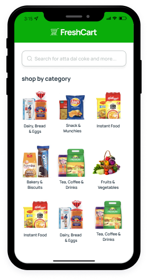
<div style="max-width: 390px;">
<div class="pt-8 px-6 px-xl-8 rounded"
	style="background: url(../../assets/images/banner/banner-deal.jpg) no-repeat; background-size: cover; height: 470px">
	<div>
		<h3 class="fw-bold text-white">100% Organic Coffee
			Beans.</h3>
		<p class="text-white">Get the best deal before
			close.</p>
		<a href="#!" class="btn btn-primary">
			Shop Now
			<i
				class="feather-icon icon-arrow-right ms-1"></i>
		</a>
	</div>
</div>
</div>
CTA #2
<div style="max-width: 390px;">
<div class="p-8 mb-3 rounded"
	style="background: url(../../assets/images/banner/ad-banner-1.jpg) no-repeat; background-size: cover">
	<div>
		<h3 class="mb-0 fw-bold">
			10% cashback on
			<br />
			personal care
		</h3>
		<div class="mt-4 mb-5 fs-5">
			<p class="mb-0">Max cashback: $12</p>
			<span>
				Code:
				<span
					class="fw-bold text-dark">CARE12</span>
			</span>
		</div>
		<a href="#!" class="btn btn-dark">Shop Now</a>
	</div>
</div>
</div>
CTA #3
Get the FreshCart app
We will send you a link, open it on your phone to download the app.
Download app from


<div class="row align-items-center">
<div class=" offset-lg-2 col-lg-4 col-md-6">
   <div class="text-center">
      <!-- img -->
      <img src="../../assets/images/png/iphone-2.png" alt="" class=" img-fluid">
   </div>
</div>
<div class=" col-lg-6 col-md-6">
   <div class="mb-6">
      <div class="mb-7">
         <!-- heading -->
         <h2>Get the FreshCart app</h2>
         <p class="mb-0">We will send you a link, open it on your phone to download the app.</p>
      </div>
      <div class="mb-5">
         <!-- form check -->
         <div class="form-check form-check-inline">
            <input class="form-check-input" type="radio" name="flexRadioDefault" id="flexRadioDefault1">
            <label class="form-check-label" for="flexRadioDefault1">
            Email
            </label>
         </div>
         <!-- form check -->
         <div class="form-check form-check-inline">
            <input class="form-check-input" type="radio" name="flexRadioDefault" id="flexRadioDefault2" checked>
            <label class="form-check-label" for="flexRadioDefault2">
            Phone
            </label>
         </div>
         <!-- form -->
         <form class="row g-3 mt-1">
            <!-- col -->
            <div class="col-lg-6 col-7">
               <!-- input -->
               <input type="text" class="form-control" placeholder="Phone">
            </div>
            <!-- col -->
            <div class="col-auto">
               <button type="submit" class="btn btn-primary mb-3">Share app link</button>
            </div>
         </form>
      </div>
      <div>
         <!-- app -->
         <small>Download app from</small>
         <ul class="list-inline mb-0 mt-3">
            <!-- list item -->
            <li class="list-inline-item">
               <!-- img -->
               <a href="#!"> <img src="../../assets/images/appbutton/appstore-btn.svg" alt=""
                  style="width: 140px;"></a>
            </li>
            <li class="list-inline-item">
               <!-- img -->
               <a href="#!"> <img src="../../assets/images/appbutton/googleplay-btn.svg" alt=""
                  style="width: 140px;"></a>
            </li>
         </ul>
      </div>
   </div>
 </div>
</div>
CTA #4
One Stop Grocery Shop
Shopping for your furry friend? Find food,
treats, and more in one easy spot.

<div class="row">
<div class="col-12">
   <div class="mb-4 bg-light d-lg-flex justify-content-between align-items-center rounded">
      <div class="  p-10">
         <h2 class="mb-1 fw-bold">One Stop Grocery Shop</h2>
         <p class="mb-0 lead">Shopping for your furry friend? Find food,<br>
            treats, and more in one easy spot.
         </p>
         <a href="#" class="btn btn-dark mt-5">Get Discount on Share</a>
      </div>
      <div class="p-6 d-lg-block d-none"><img src="../../assets/images/svg-graphics/store-graphics.svg" alt="" class="img-fluid">
      </div>
   </div>
  </div>
</div>
CTA #5
$30 discount for your first
order
Get top deals, latest trends, and more.
Join our email subscription now to get updates on promotions and coupons.
<div class="bg-dark"
style="background: url(../../assets/images/svg-graphics/pattern.svg) no-repeat; background-size: cover; background-position: center">
<div class="container">
<!-- row -->
<div class="row">
<div class="offset-lg-1 col-lg-10">
<div class="row align-items-center">
<!-- col -->
<div class="col-md-6">
<div class="text-white mt-8 mt-lg-0">
<span>$30 discount for your first
order</span>
<h2 class="h2 text-white my-4">Get top
deals, latest trends, and more.</h2>
<p class="text-white-50">Join our email
subscription now to get updates on
promotions and coupons.</p>
<!-- form -->
<form class="row g-3 needs-validation" novalidate>
<div class="col-6">
<!-- input -->
<label for="emailAddress" class="form-label visually-hidden">Email Address</label>
<input type="email" class="form-control" id="emailAddress" placeholder="Enter Email Address" required>
<div class="invalid-feedback">
Please enter email.
</div>
</div>
<!-- btn -->
<div class="col-auto">
<button type="submit" class="btn btn-primary mb-3">Sign Up</button>
</div>
</form>
</div>
</div>
<!-- col -->
<div class="col-md-6">
<div class="text-center">
<!-- img -->
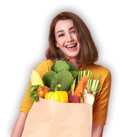
<img src="../../assets/images/png/girl-email.png"
alt="" class="img-fluid" />
</div>
</div>
</div>
</div>
</div>
</div>
</div>CTA #6


<div class="my-lg-14 my-8">
<div class="container">
<!-- row -->
<div class="table-responsive-xxl">
<div class="row flex-nowrap">
<div class="col">
<div class="card border-0 card-hover">
<a href="#!" class="img-zoom"> <img src="../../assets/images/banner/ad-banner-4.jpg" alt=""
class=" rounded"></a>
<div class="position-absolute bg-dark-info w-100 bottom-0 py-3 px-4 rounded-bottom">
<a href="#!" class="text-white d-flex align-items-center btn-transition">Offer
<i class="feather-icon icon-chevron-right fs-5"></i></a>
</div>
</div>
</div>
<div class="col">
<div class="card border-0">
<a href="#!" class="img-zoom"> <img src="../../assets/images/banner/ad-banner-5.jpg" alt=""
class=" rounded"></a>
<div class="position-absolute bg-dark-warning w-100 bottom-0 py-3 px-4 rounded-bottom">
<a href="#!" class="text-white d-flex align-items-center btn-transition">Fresh Food &
Bakery
<i class="feather-icon icon-chevron-right fs-5"></i></a>
</div>
</div>
</div>
<div class="col">
<div class="card border-0">
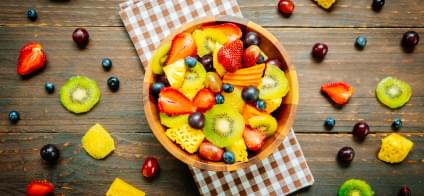
<a href="#!" class="img-zoom"><img src="../../assets/images/banner/ad-banner-6.jpg" alt=""
class=" rounded"></a>
<div class="position-absolute bg-dark-danger w-100 bottom-0 py-3 px-4 rounded-bottom">
<a href="#!" class="text-white d-flex align-items-center btn-transition">Mixed and
Assorted fruits
<i class="feather-icon icon-chevron-right fs-5"></i></a>
</div>
</div>
</div>
</div>
</div>
</div>
</div>CTA #7
Welcome to FreshCart
Download the app get free food & $30 off on your first order.<div class="row">
<!-- col -->
<div class="col-12">
<!-- cta -->
<div class="bg-light d-lg-flex justify-content-between align-items-center py-6 py-lg-3 px-8 text-center text-lg-start rounded">
<!-- img -->
<div class="d-lg-flex align-items-center">
<img src="../../assets/images/about/about-icons-1.svg" alt="" class="img-fluid" />
<!-- text -->
<div class="ms-lg-4">
<h1 class="fs-2 mb-1">Welcome to FreshCart</h1>
<span>
Download the app get free food &
<span class="text-primary">$30</span>
off on your first order.
</span>
</div>
</div>
<div class="mt-3 mt-lg-0">
<!-- btn -->
<a href="#" class="btn btn-dark">Download FreshCart App</a>
</div>
</div>
</div>
</div>